|
-
24th February 13, 01:11 PM
#1
New Sporran Design, Comments Please
I have been working on a new design for a daywear sporran.
I ran into a technical problem that I will have to fix, but I would appreciate some feedback from the X Marks rabble on the design before I proceed further.
The new design incorporates the Rampant Lion of Scotland on top of the Saltire flag. It is painted onto the front flap after I carved and stamped the design into the leather.
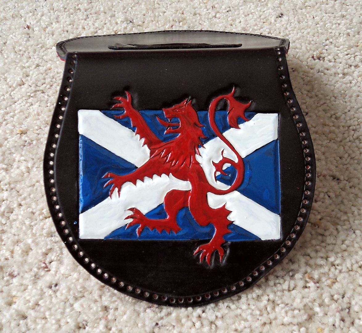
Is this a design that would be marketable at local Highland Games? Is it too gaudy?
Before I go to the effort of finishing the lacing of the gusset to this piece, I would like to know if it would be worth the effort.
I have also included a picture of another sporran with only the Rampant Lion, which I have shown previously on this forum.
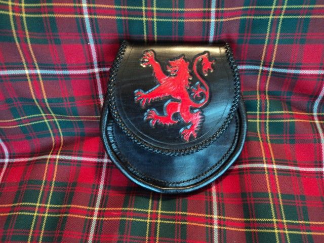
This pattern is simpler and more appealing to me in many ways, but I wanted to do the Lion/Saltire to see how it looked.
Any and all comments would be appreciated.
Thanks
Tom
-
-
24th February 13, 01:17 PM
#2
There's always somebody who will buy anything. Put it into your lineup with other things and there will be somebody who will love it. When you see how fast it goes, you'll know if you should make another or a lot more, but I'm sure it won't be a lost cause.
By the way, your craftsmanship is impressive!
Rev'd Father Bill White: Mostly retired Parish Priest & former Elementary Headmaster. Lover of God, dogs, most people, joy, tradition, humour & clarity. Legion Padre, theologian, teacher, philosopher, linguist, encourager of hearts & souls & a firm believer in dignity, decency, & duty. A proud Canadian Sinclair with solid Welsh and other heritage.
-
-
24th February 13, 02:47 PM
#3
Tom,
I like the Lion rampant by itself far, far better. I would not personally wear the other. (I do suggest making the lion just a tad smaller though.)
Cheers
Jamie
-See it there, a white plume
Over the battle - A diamond in the ash
Of the ultimate combustion-My panache
Edmond Rostand
-
-
24th February 13, 03:21 PM
#4
Thanks for your feedback, Jamie.
I think I agree with you that the Lion should be slightly smaller, and stand alone on the front flap.
 Originally Posted by Panache

Tom,
I like the Lion rampant by itself far, far better. I would not personally wear the other. (I do suggest making the lion just a tad smaller though.)
Cheers
Jamie
-
-
24th February 13, 04:04 PM
#5
For me it is the first one. The second, doesn't have enough contrast between the red and the black for my liking. Maybe a different colour - dark brown or grey.
But the first one, I certainly like. Not everyone will see the significance of the rampant lion without the yellow background, but they will all recognise the saltire.
Regards
Chas
-
-
24th February 13, 04:38 PM
#6
Chas, Thanks for the feedback.
If I do the Lion/Saltire again, I think I will make it slightly smaller and use a flat finish paint instead of the glossy paint on this one. I also think I will try a lighter shade of blue. I looked at many saltires on Google images and there was quite a variation in the blue color.
Originally Posted by Chas
For me it is the first one. The second, doesn't have enough contrast between the red and the black for my liking. Maybe a different colour - dark brown or grey.
But the first one, I certainly like. Not everyone will see the significance of the rampant lion without the yellow background, but they will all recognise the saltire.
Regards
Chas
-
-
24th February 13, 05:12 PM
#7
As someone who has made a few dozen sporrans over the last few years, I have found that less is often more. Perhaps having the flag in blue and white stains, or simply stamped/carved rather than painted so it is more subdued would carry the same message and make the lion "pop" rather than the two competing with each other. I can't tell you how much leather I have discarded after seeing my "great" ideas turn out to be less than what I had hoped for.
Still, finish it off. There's a buyer out there somewhere.
Last edited by MNlad; 24th February 13 at 05:14 PM.
" Anything worth doing is worth doing slowly." - Mae West -
-
-
24th February 13, 05:15 PM
#8
I really like the flat paint and lighter colors idea for the saltire Tom. It will move the lion to infront of the flag instead of appearing on the flag.
slàinte mhath, Chuck
Originally Posted by MeghanWalker,In answer to Goodgirlgoneplaids challenge:
"My sporran is bigger and hairier than your sporran"
Pants is only a present tense verb here. I once panted, but it's all cool now.
-
-
24th February 13, 05:37 PM
#9
Tom: One person's opinion - take it for what it's worth. I know nothing about the design or crafting of sporrans. I'm just a "customer".
The first pattern is too big, too bold, and too bright for me, though I like the idea. But, I would heed Father Bill's advice - someone out there will love it, so see how the market responds.
The second (rampant lion only) is much better, but still a little too bright and bold for me.
Finally, I really like/prefer many of the sporrans with more subtle fronts in your albums. They look very attractive and, thus, more appealing. Examples include the white rampant lion, the harp, the unicorn, the Celtic cross, the wild boar, to name a few.
John
I changed my signature. The old one was too ridiculous.
-
-
24th February 13, 06:01 PM
#10
MNlad, Thanks for your comments. One idea I have is to do it in brown with the blue of the Saltire stamped with a background tool and the white stripe coated so that it comes out lighter than the rest of the sporran. I agree that less is better most times. I will reduce it in size also. LOL, I usually do a new design on a piece of scrap leather first, but I've done several Lions and wanted to see how it would turn out. My biggest problem with this piece is that I used Super Shene on the leather before painting it and the paint is flaking off!
Originally Posted by MNlad
As someone who has made a few dozen sporrans over the last few years, I have found that less is often more. Perhaps having the flag in blue and white stains, or simply stamped/carved rather than painted so it is more subdued would carry the same message and make the lion "pop" rather than the two competing with each other. I can't tell you how much leather I have discarded after seeing my "great" ideas turn out to be less than what I had hoped for.
Still, finish it off. There's a buyer out there somewhere.
-
 Posting Permissions
- You may not post new threads
- You may not post replies
- You may not post attachments
- You may not edit your posts
-
Forum Rules
|
|


Bookmarks