|
-
9th April 15, 10:40 AM
#1
 Originally Posted by OC Richard

I rather like the new tartan from an aesthetic standpoint. Looking forward to seeing a kilt made up in it.

It's tough to take something else, such as a flag, and turn it into pleasing woven fabric. Combining two flags is harder yet, but somehow it all works for me.
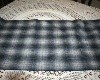
My only quibble is that of 'scale', the very fine lines which give those portions an un-tartan-like look. One sees it in fashion plaid fabric all the time, fine lines giving the illusion of the edges being blurred, like this
Traditional tartans always seem to have a certain consistency of scale.
It does take the symbolism thing (which was originally not a part of tartan design) to new absurd heights. Even the number of threads have symbolism? What if it's woven in a bigger or smaller sett? And "mythical unicorn"? Oh dear.
Yes I see that Nova Scotia uses the same elements, yet the two tartans look quite different to me.
Oddly, just today I was looking at various renderings of the Nova Scotia tartan and noticing that in some the red line is very fine, so that from a distance the tartan looks mostly blue & gold, but on others the red line is thick making the tartan look blue & orange.
BTW I notice on the two examples of Nova Scotia shown above one has the red line centered, the other offcenter.
Good eye on the off centre red. I'll have to look at my woven stuff at home to see which is more common. I just grabbed those examples from the internet.
Obviously the addition of the green in Nova Scotia is one thing that makes it rather different.
I actually quite like the look of the tartan and that there's a history lesson baked in. I'm inclined to agree with David that the world doesn't "need" another universal tartan but I like that people continue to make tartans for various and sundry causes.
I also like the use of symbolism of colour choice in regional tartans in particular (although I admit the thread count pushes it due to inevitable sett variations). The reason I think it's important to draw on symbolism like this is that you have to justify the tartan as a symbol of the people or place you're naming it after. Using elements characteristic of the people, existing totems or topography of a place is a great way for the people to take ownership of and endorse a tartan design. I cite the Cape Breton tartan as a case in point. Historically, tying colours to a clan tartan wasn't necessary for its adoption when Wilson's of Bannockburn and the Hay Sobiesky Stuart brothers were assigning clans to tartans because they were pushing the mythology of an established history to back it up. Obviously, this point doesn't address tartans lifted from found cloth or famous portraits.
Natan Easbaig Mac Dhòmhnaill, FSA Scot
Past High Commissioner, Clan Donald Canada
Yet still the blood is strong, the heart is Highland, And we, in dreams, behold the Hebrides. - The Canadian Boat Song.
-
-
9th April 15, 01:05 PM
#2
I have to say the picture of actual cloth looks much better than the picture of the tartan that is just a picture (with an unpleasant optical illusion effect for me). I have to agree with Richard that the fine lines take away from the general look of the tartan, but overall it is not bad.
-
-
9th April 15, 01:13 PM
#3
I'm quite fond of it. Being a medievalist, I like the inclusion of heraldic themes. My love of symbolism does stop at the thread count. That seems excessive. As for the colors; I like the contrast. I've seen enough blue/green, blue/violet, red/black, and so-on, in universal tartans to make my eyes glaze over.
Yes, I know that I wear three blue/green based tartans. However, one is the Ferguson tartan, and one does not pick one's clan based on it's tartan. Besides, I wear the weathered colors.
Keep your rings charged, pleats in the back, and stay geeky!
https://kiltedlantern.wixsite.com/kiltedlantern
-
-
9th April 15, 02:14 PM
#4
I like it!
But then again, I LOVE MacLeod of Lewis, too. I'd wear it in a heartbeat. Too bad it'll be forgotten within a year or so.
-
-
9th April 15, 05:26 PM
#5
Originally Posted by S.S.Muldoon
Too bad it'll be forgotten within a year or so.
You never know! Isle of Skye is a modern design and due to its sheer beauty became one of the most popular kilt hire tartans and is widely worn many years later.
Scotland 2000 is a tartan with a seemingly limited purpose yet it can be seen at many Games being worn by pipe bands 15 years after the millennium.
Proud Mountaineer from the Highlands of West Virginia; son of the Revolution and Civil War; first Europeans on the Guyandotte
-
-
9th April 15, 05:29 PM
#6
Originally Posted by Sir Didymous
I like the inclusion of heraldic themes.
Yes the Allen Brothers 'tartan as heraldry' idea is alive and well nearly 200 years on!
Proud Mountaineer from the Highlands of West Virginia; son of the Revolution and Civil War; first Europeans on the Guyandotte
-
-
10th April 15, 09:29 AM
#7
I like the tartan design from a visual perspective, and appreciate the thought and symbolism that was built in. I don't think it's a color comination that would look good on me, however. Hopefully it gains enough popularity to last.
-
-
14th April 15, 04:26 AM
#8
The thing that can make a tartan stick around for decades is if some Pipe Band adopts it.
Kitting out a Pipe Band is a massive investment and bands tend to keep their tartan, once adopted, for 20 years or more.
Especially if the band is a high-visibility one, in Grade One, the tartan gets a load of exposure and sooner or later other bands might adopt it.
So 20 or 30 years from now this Declaration tartan might be a common sight at a large number of Games, if one or more bands go for it.
It's a good band tartan, by the way. It behooves Pipe Bands to adopt tartans with striking colours and bold contrasts, because band tartans are viewed en masse and at distance.
Last edited by OC Richard; 14th April 15 at 04:29 AM.
Proud Mountaineer from the Highlands of West Virginia; son of the Revolution and Civil War; first Europeans on the Guyandotte
-
The Following User Says 'Aye' to OC Richard For This Useful Post:
-
14th April 15, 06:00 AM
#9
I rather like it, particularly the colour palette. Less enthusiastic about all of the gradient lines and I think that the symbolism is overly complicated. Would I wear it, probably. Would I buy it, highly unlikely.
St. Andrew's Society of Toronto
-
The Following User Says 'Aye' to JohntheBiker For This Useful Post:
 Posting Permissions
- You may not post new threads
- You may not post replies
- You may not post attachments
- You may not edit your posts
-
Forum Rules
|
|


Bookmarks