


It's a visual thing. Most people's eye prefers symmetry.
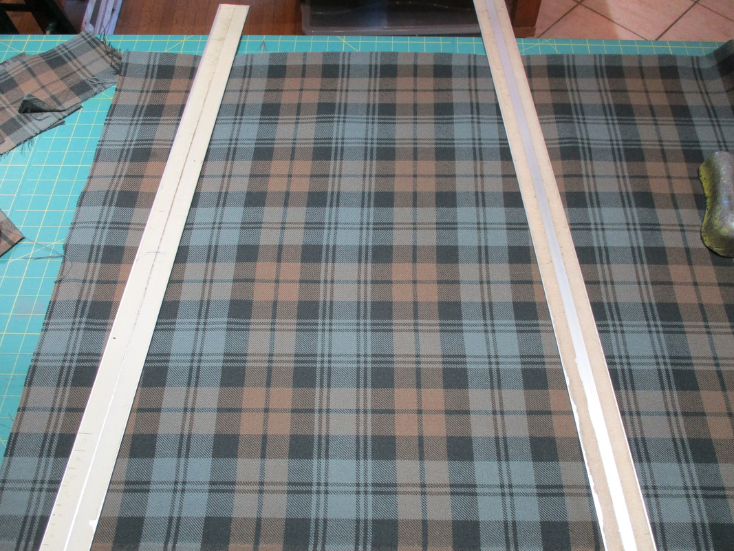
Here is a Black Watch Tartan apron as an example.
This looks Off somehow -
Even if you can't put your finger on what is off.
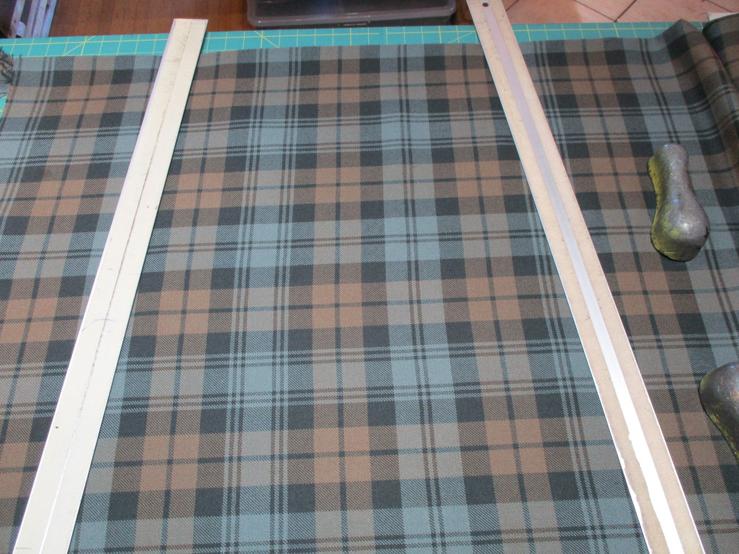
While to many people this looks OK -

User Tag List
Results 1 to 6 of 6
Thread: Front apron design/layoutThreaded View
|


Bookmarks