
Originally Posted by
PiperPadre

Yes, a darker brown. It's a smart compliment to the tartan under discussion.
So interesting that you chose the word compliment!
Because that word happens to have a technical meaning in art-speak.
Here's a colour-wheel
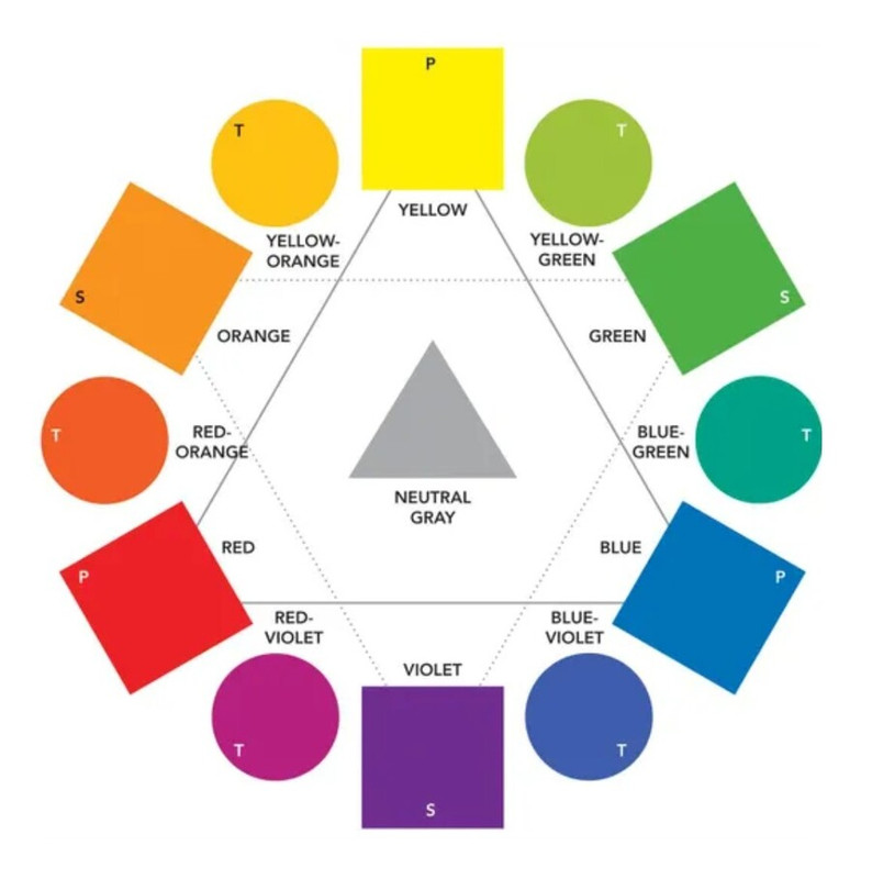
Colours that are directly across from each other, for example red and green, are termed "complimentary" colours.
As we know a vast number of tartans are based on that exact pair.
You'll note that also directly across from one another are blue and orange, the very "complimentary" pair that, to my eye, works so well with the Glen Affric tartan.
And, yes, Universities and sports teams etc often pick a complimentary pair for their school or team colours.
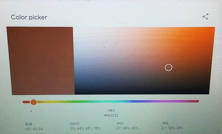
Below is one of those online things where you can create any colour.
The factors are
1) Hue: This is the pure colour as would appear on the colour-wheel, in this case it's the slider at the bottom, now positioned on orange.
2) Saturation: This is the continuum between the pure Hue and grey, in other words as you move the little circle from the right edge (the pure Hue) to the left side (grey) the colour becomes more and more dull, less and less 'saturated'.
3) Value: How light or dark the colour is, in this case as dark as possible at bottom and as light as possible at top.
So you can see here that, in fact, orange and brown are the same Hue, just different in Value. (They can also be different in Saturation.)
To create our Peat tweed, which is darker and less-saturated to where the little circle currently is, I'd just have to move that little circle a bit further left (less saturation) and a bit further down (darker).
Last edited by OC Richard; Today at 02:11 AM.
Proud Mountaineer from the Highlands of West Virginia; son of the Revolution and Civil War; first Europeans on the Guyandotte



 Reply With Quote


Bookmarks