X Marks the Scot - An on-line community of kilt wearers.
|
-
19th December 10, 08:19 AM
#10
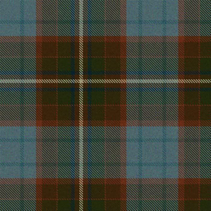
After a lot of fiddling about, I've come up with another design that I think I'm happier with- having taken the feedback from the prior design.
The green is gone, as I am having trouble balancing the design without it ending up GREEN or just 'blah'.

I've simplified the darker field, and gone with a richer, more coppery colour. The blue is fairly close to what I want as well.
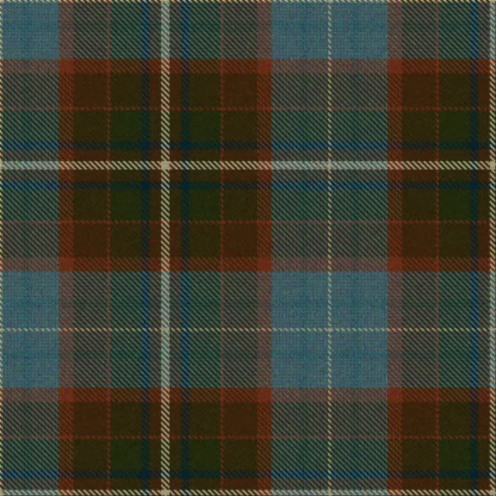
Below is a variant incorporating an additional vanilla stripe through the blue field, but I don't think that I like this one as much as the above.

Any thoughts from the rabble? I still really like the idea of the lighter, more simple blue field being 'hidden' inside the pleat, either as a box or knife pleat which would give a very dynamic 'reveal' as the pleats swish.
-
Similar Threads
-
By Mark Keeney in forum The Tartan Place
Replies: 11
Last Post: 15th September 06, 11:08 AM
 Posting Permissions
- You may not post new threads
- You may not post replies
- You may not post attachments
- You may not edit your posts
-
Forum Rules
|
|


Bookmarks